Diligent Unified Design System & Refresh

A tablet showing the refreshed Diligent Boards home screen, over pages from the Atlas design system

The refreshed product with pages from the design system
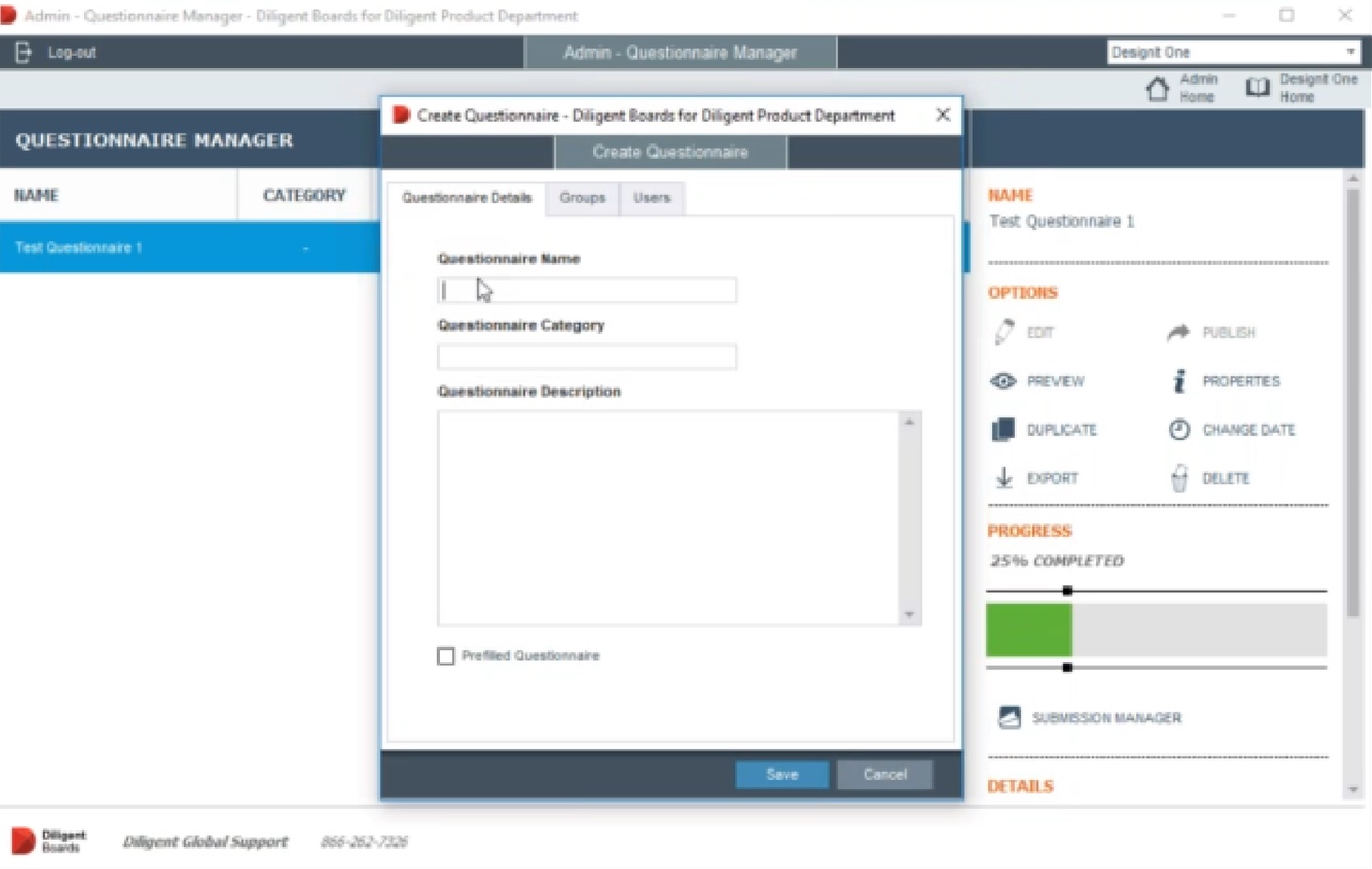
The original questionnaire manager: a grey desktop window with a small dialog, orange headings and a blue selected row

Original product screen example

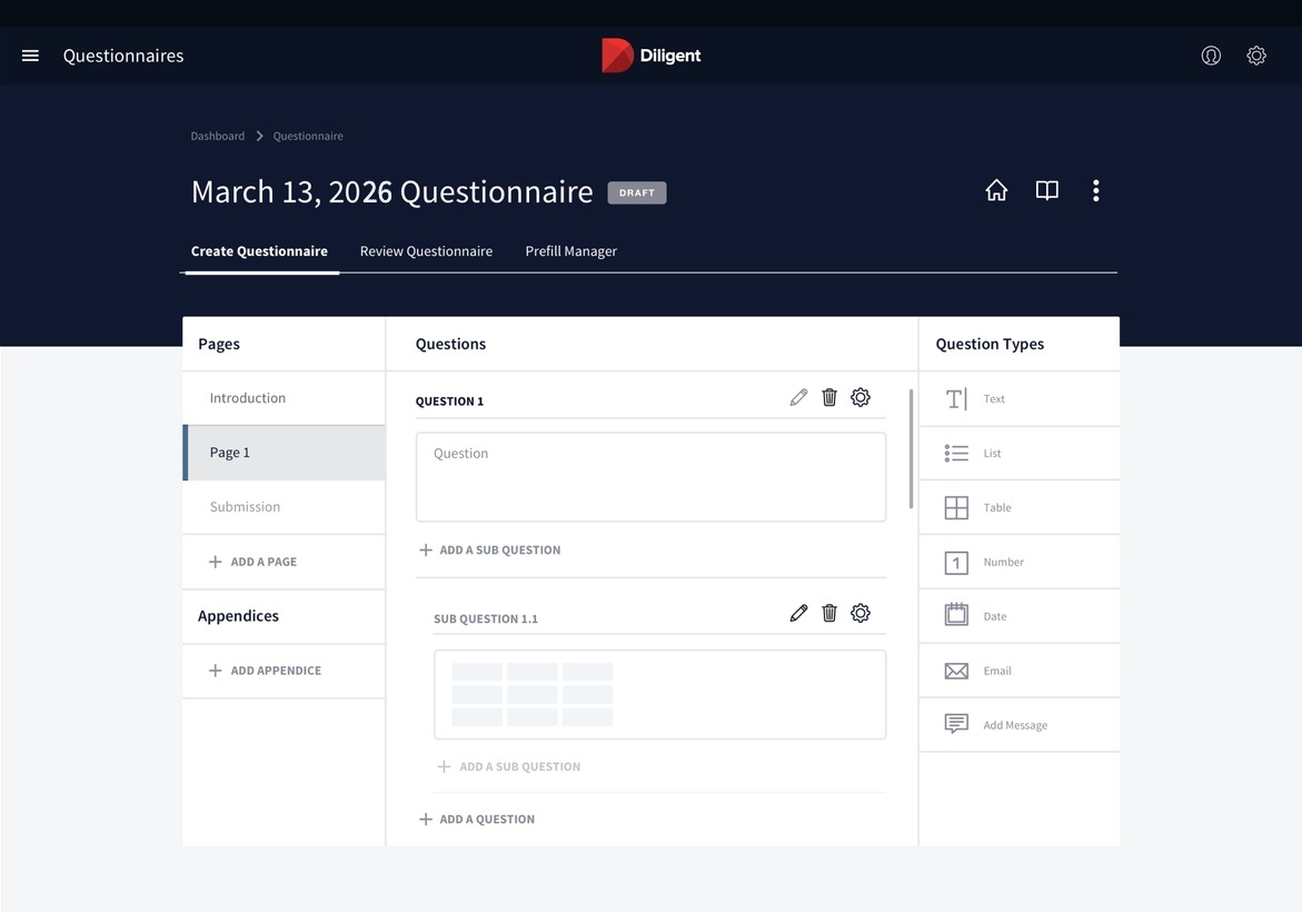
The refreshed questionnaire screen: a navy header, white cards for pages, questions and question types

Refreshed product screen example

Challenge

Diligent, a SaaS company that helps corporate boards run their work, had acquired several competitors and needed to bring their products into its portfolio.

The company set out to build a unified design system that would refresh the brand across its products and speed up development as new ones joined.

Senior Designer · Style studies, key screens and the Atlas design system
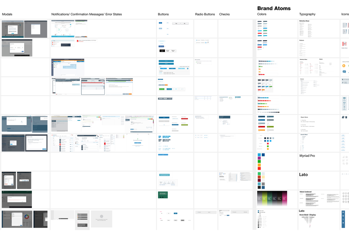

The interface inventory: a sheet of every modal, notification, button, form control, color and type style found across the products

Interface inventory

Process

An inventory of interface elements, assets and frameworks across the current products and new acquisitions gave us a clear picture of the existing ecosystem and where it diverged.
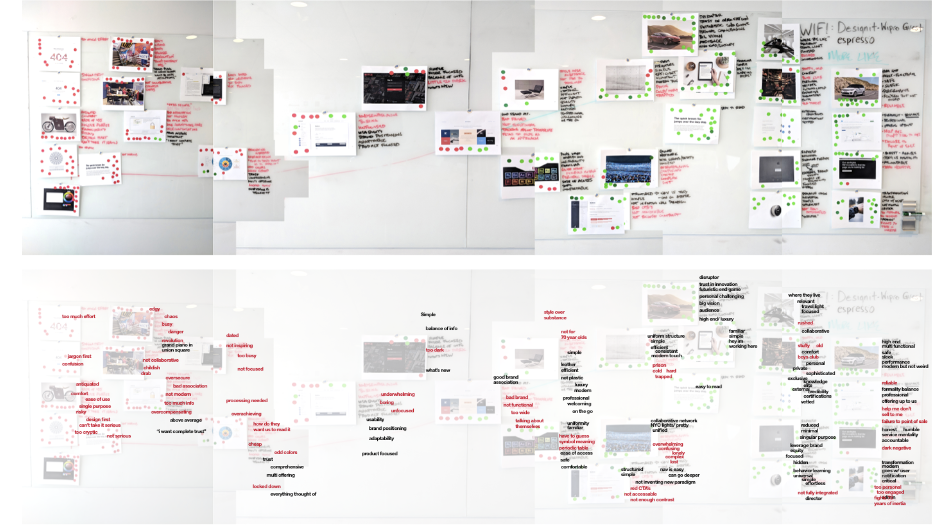
Wall boards from the stakeholder session, covered in screenshots, red notes and green voting dots

Stakeholder voting boards

To align on direction, stakeholders voted on the qualities they wanted the product to convey. The results gave us a shared set of attributes to guide our visual style studies.

Hover over an attribute to explore.Tap an attribute to explore.

Diligentproducts ability to go deeper trustworthy honest singular purpose respected substance over style utility solid not inventing new paradigm indisputable tested strong humble confident universal heritage organized expert professional credible sensible steadfast reliable vetted secure very skilled above average not everyman high end elite accountable conscientious private sophisticated luxury exclusive bridge old and new not cheesy achieved a high level nimble architectural expansive airy positive inclusive forward motion current sophisticated light modern not an old boys club flexible sleek fresh self-aware not weird calm futuristic end game knowledge high tech inside transformative one step ahead critical big vision easy to read trust in innovation inventive never thought of before streamlined uncharted waters disruptor efficient useful what’s new modern cool ease of access certified structured serious node based multi offering fits their life collaborative good brand association not plastic sturdy service mentality network based multi functional mobile not silicon valley BS prudent external formality balance audience on the go complete trust high performing collaborative relevant considered paced familiar welcoming meeting them where they live seamless personal comfortable concise integrated adaptable safe functional intelligent easy to plan effortless coordinated inclusive balance of information clarifying accessible professional grounded consistent helpful processed minimal uniformity straightforward focused efficient transparent seamless balance of info comprehensible brief spare decisive usability simple complete uniform structure

Hover over an attribute to explore.

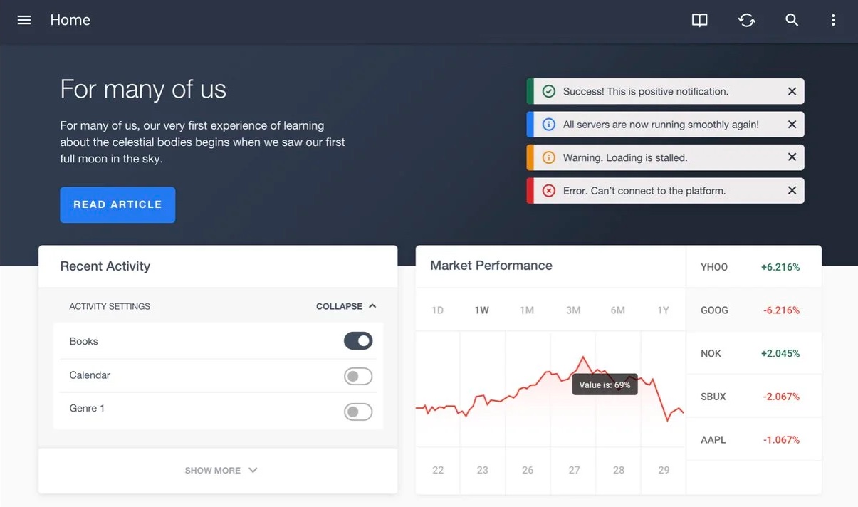
SeamlessFamiliar, Welcoming, Functional
Seamless style study: a dark navy header over a light dashboard with notifications, an activity card and a market chart
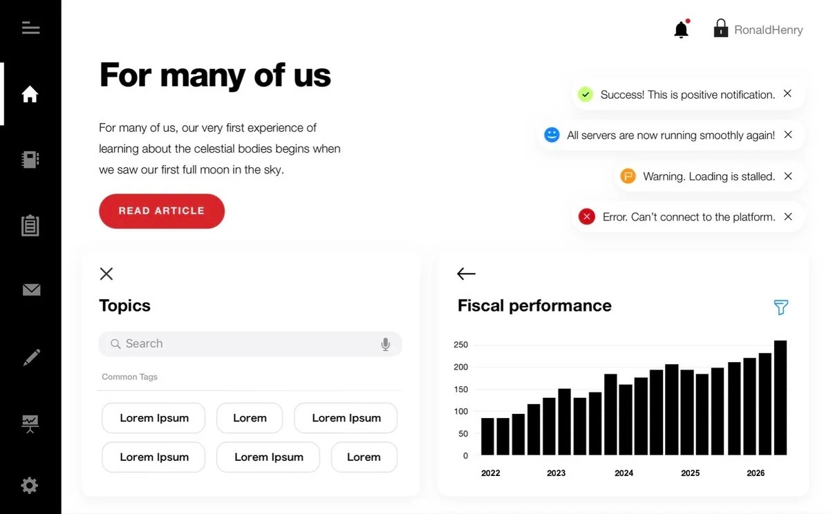
SleekElegant, Streamlined, Fresh
Sleek style study: a white page with a black icon rail, bold headings, a red button, rounded tags and a black bar chart
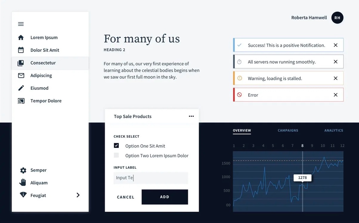
ExpertElite, Credible, Indisputable, Solid
Expert style study: a serif heading, a white side menu, outlined notifications and a form and line chart on a dark navy band

These attributes became three style directions, each offering a different take on the Diligent brand.

Stakeholders aligned on the Seamless direction, giving us a cohesive visual language to carry into the design system files.
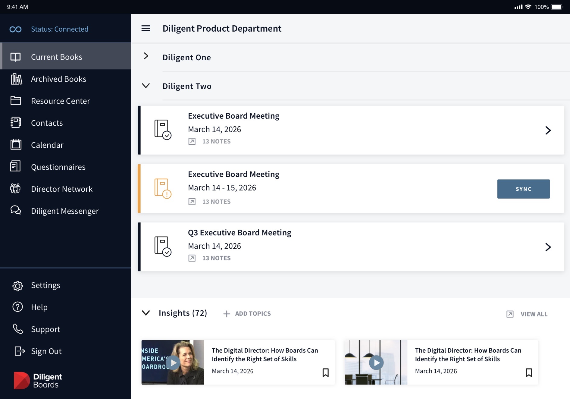

Key product screen: the dashboard, with a dark side menu, a list of board meetings and an insights row

Key product screen: Dashboard

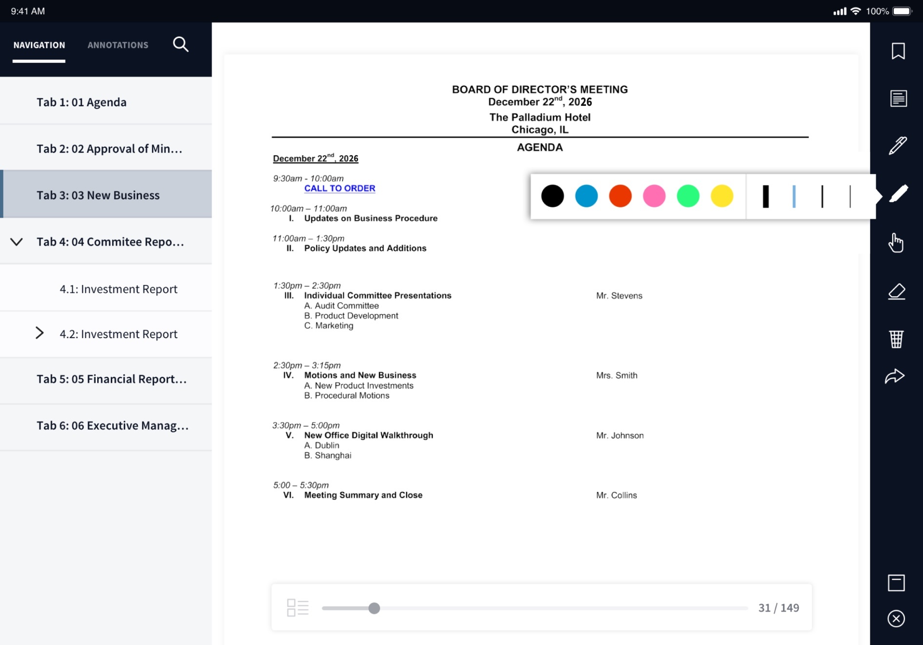
Key product screen: the reader, showing a meeting agenda with a tab list on the left and annotation tools on the right

Key product screen: Reader

Key product screen: the book builder, with a navy header and a list of tabs and documents

Key product screen: Book Builder

Visual Refresh

I applied Seamless to key product screens, then translated those decisions into a foundational design system for Diligent's in-house team to build on and make their own.
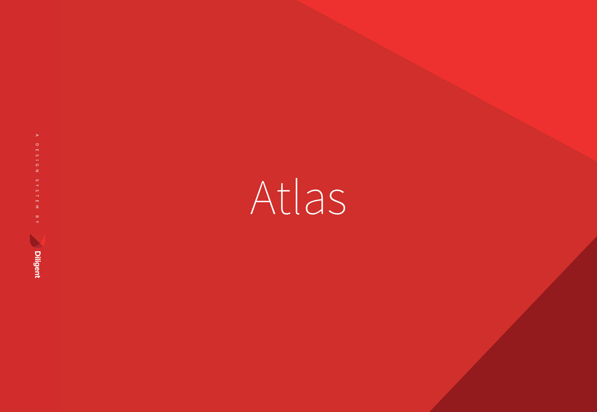

The cover of the Atlas design system: the word Atlas on a red faceted background

Atlas cover

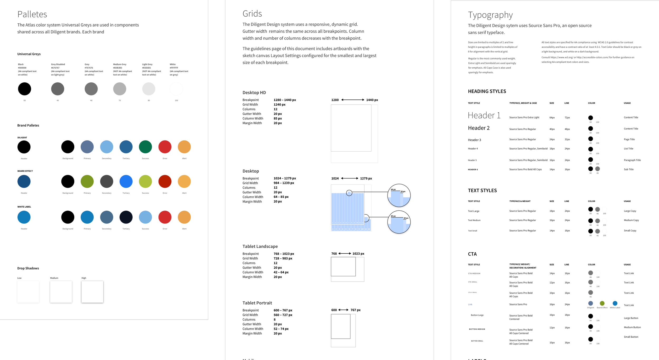
Three pages from Atlas: color palettes, grids and typography

Atlas pages: color, grids and typography

Design System

We named the system Atlas, after the Titan of Greek myth who carried the weight of the heavens.

It was organized into three sections:

Principles
The strategic direction behind every decision
Guidelines
The rules and foundations used to create new components
Components
Standardized building blocks, ready to drop into screen flows and update over time
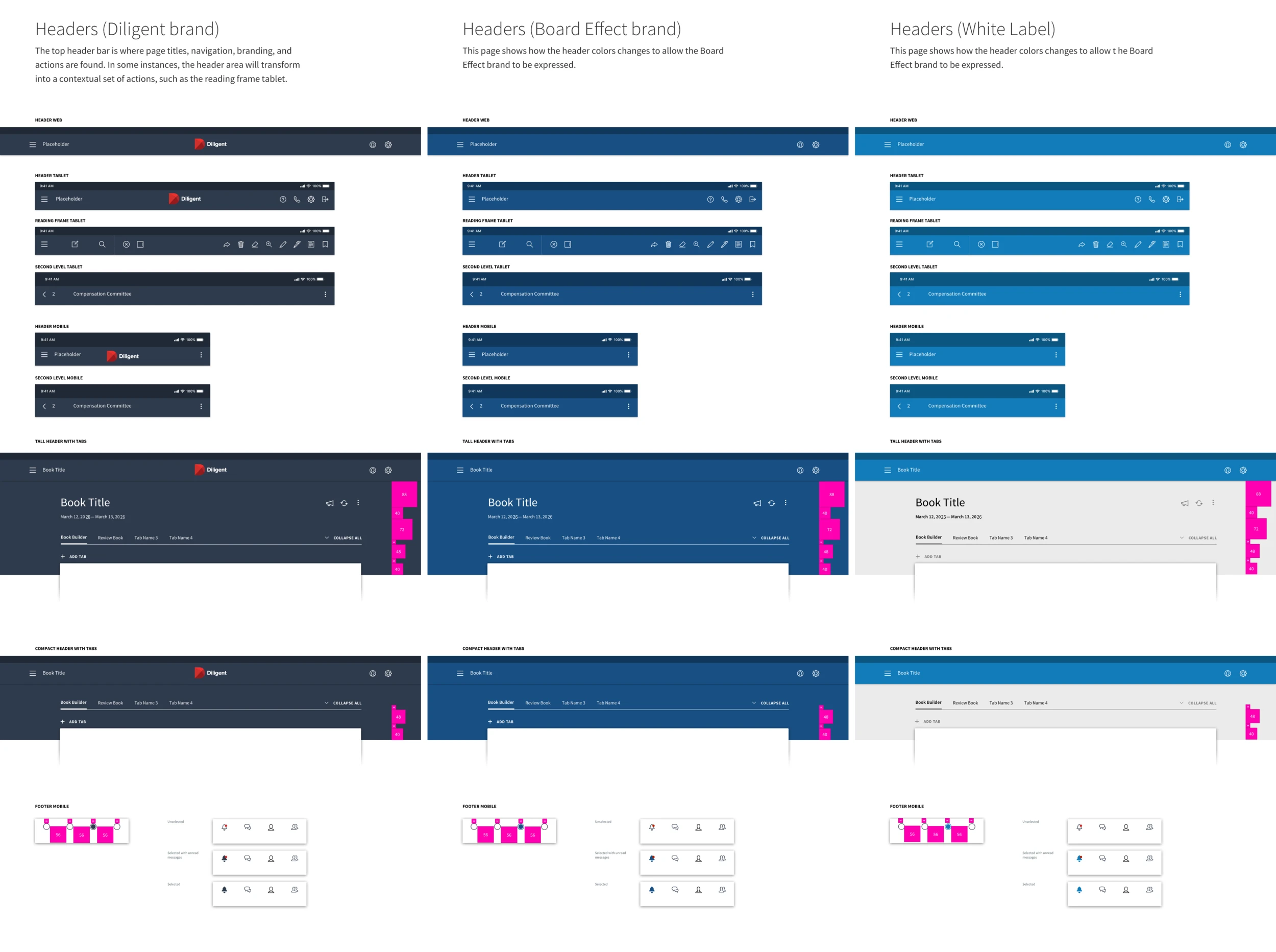
Header components in three brand options side by side: Diligent, BoardEffect and white label

Header components in the three brand options

Diligent wanted the system to support multiple brands under its name. For core product screens, I created components in three brand options: the original Diligent brand, the secondary BoardEffect brand (Diligent's mass-market offering) and a white-label version for companies that wanted to personalize the software with their own colors and logos.

DiligentBook Editor
Executive Board MeetingSeptember 14, 2026 · 12 notes
All servers are now running smoothly again!
✓
color.header.background
color.action.primary
color.accent
color.surface.tint
brand.name

Key components were built on design tokens, allowing colors, type and other brand attributes to be swapped without rebuilding the components.
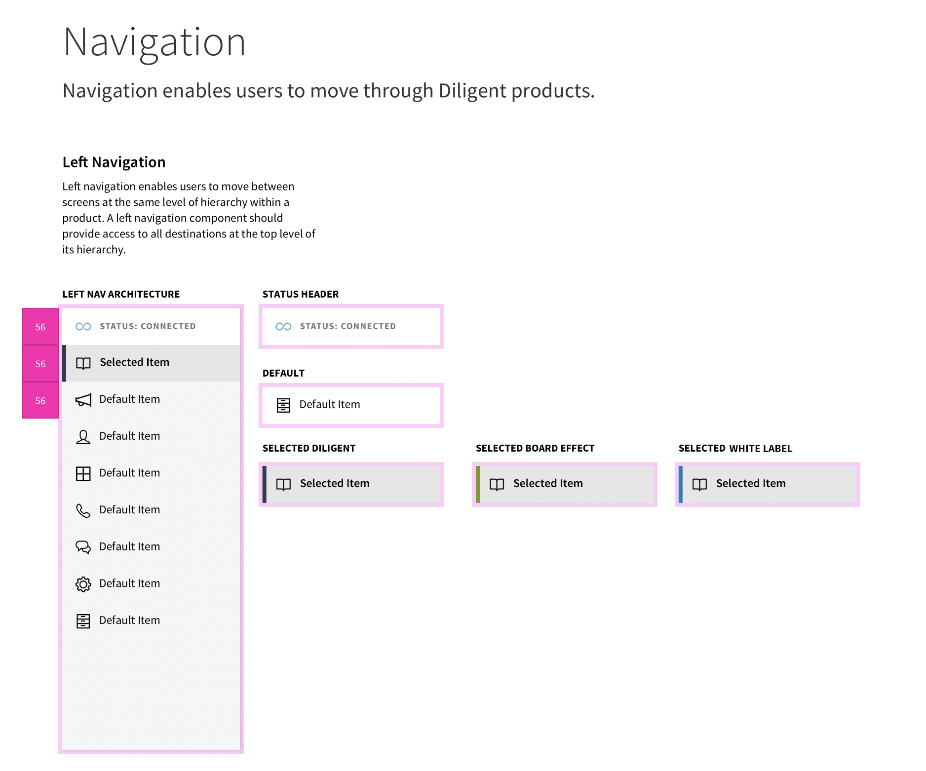
The navigation guideline page: left navigation architecture, the status header and selected states for each brand

Navigation guidelines

I designed a unified navigation pattern with multiple states to work consistently across every product.
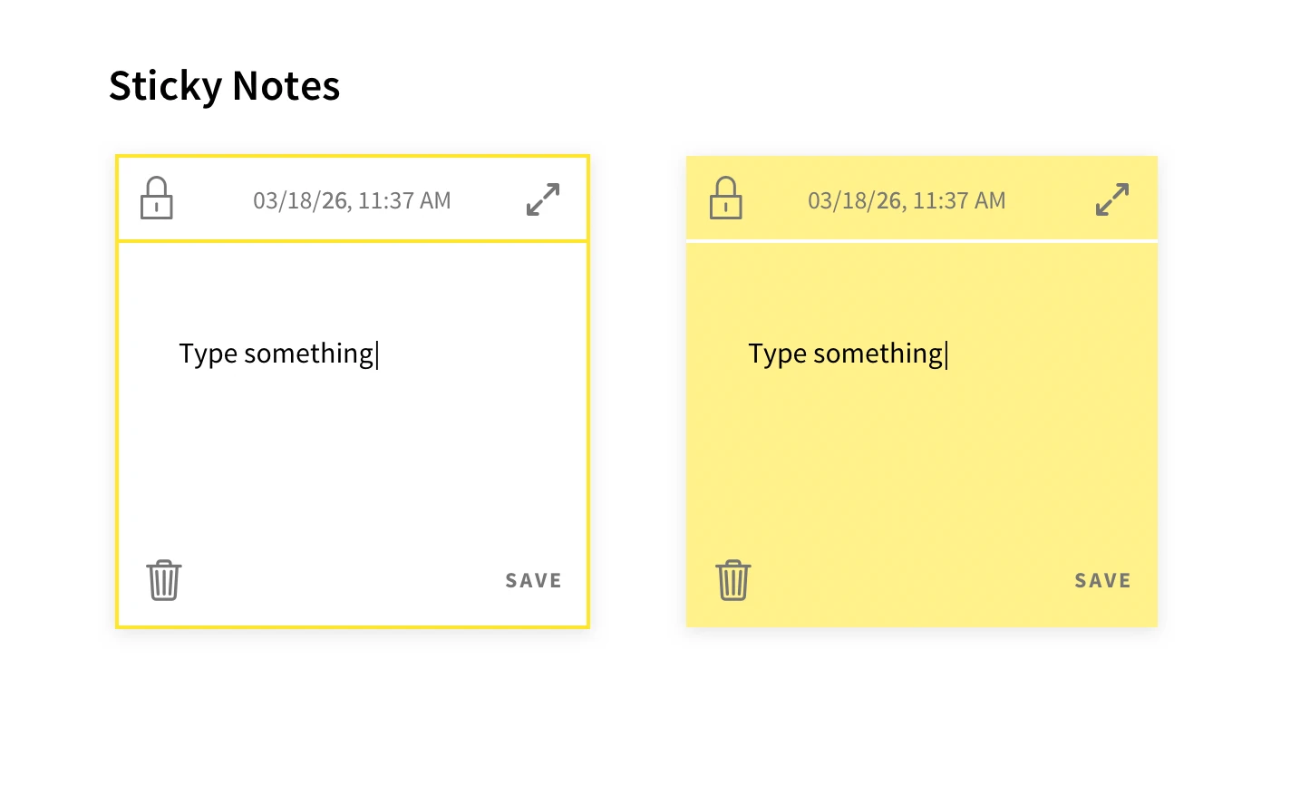
Sticky note components: an outlined note and a filled yellow note

Sticky notes

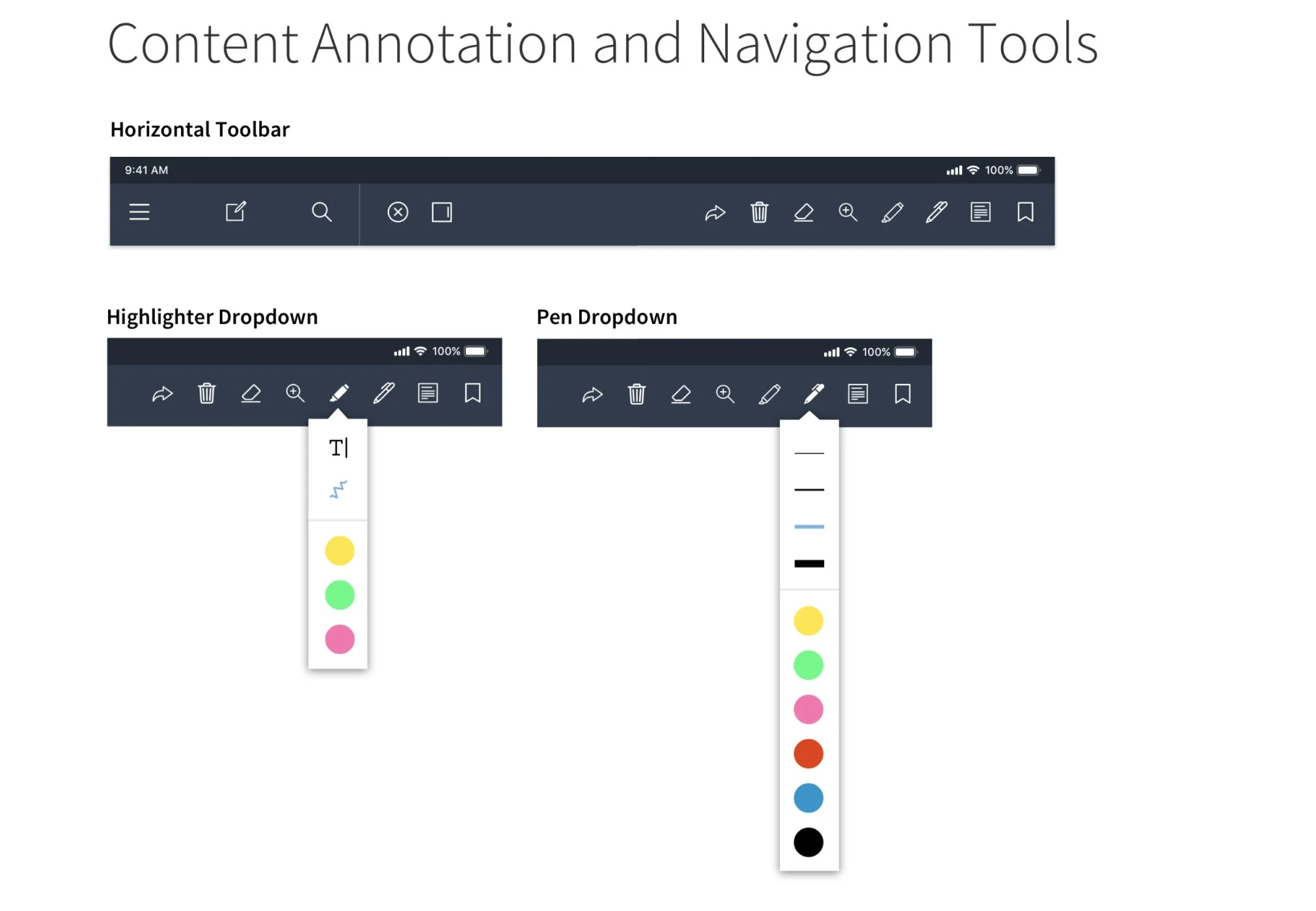
Content annotation and navigation tools: a horizontal toolbar with highlighter and pen color dropdowns

Annotation tools

The system also extended into smaller, more playful details like sticky notes and content annotation tools.
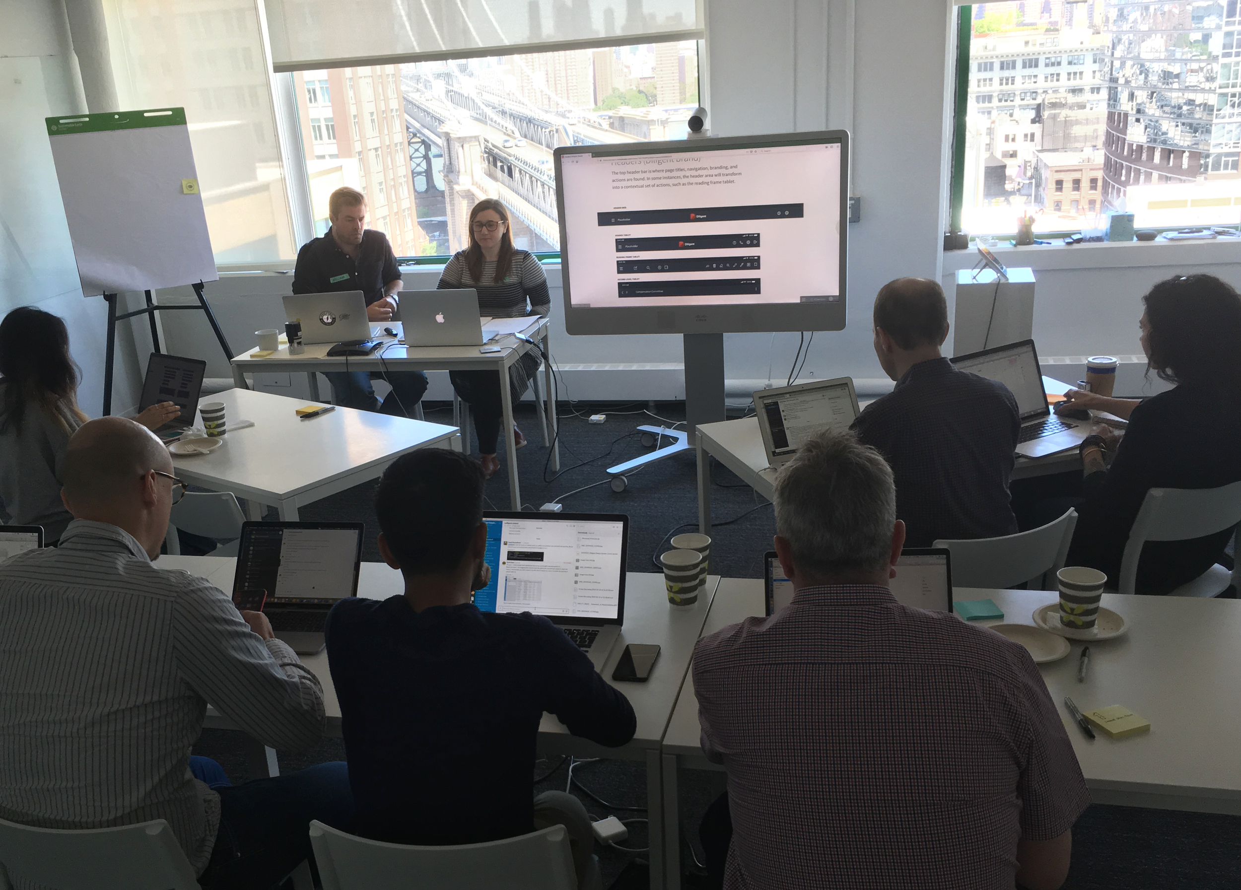

Diligent's design team around a table with laptops during the adoption workshop

Adoption workshop

Adoption and Impact

Alongside the principles, guidelines and components, we delivered a full-day workshop to immerse Diligent's design teams in the new system and encourage adoption.

“It’s working. The project did what we hoped it would do — set us on a path with a good foundation. Product teams are really happy. Dev teams are excited.”

— Diligent Design Operations Manager

Within four months of launch, seven Diligent products had adopted Atlas, with new products already being planned on the system.