Click Therapeutics Addiction App Concepts

Challenge

Digital therapeutics company Click Therapeutics wanted to explore an app for people in treatment for opioid use disorder.

I developed three directions, each going beyond look and feel to a narrative concept for the whole experience, carried through short daily lessons, a toolkit for urges in the moment, and Go/No Go, a word game that builds impulse control.

Lead Concept and Visual Designer · All three directions
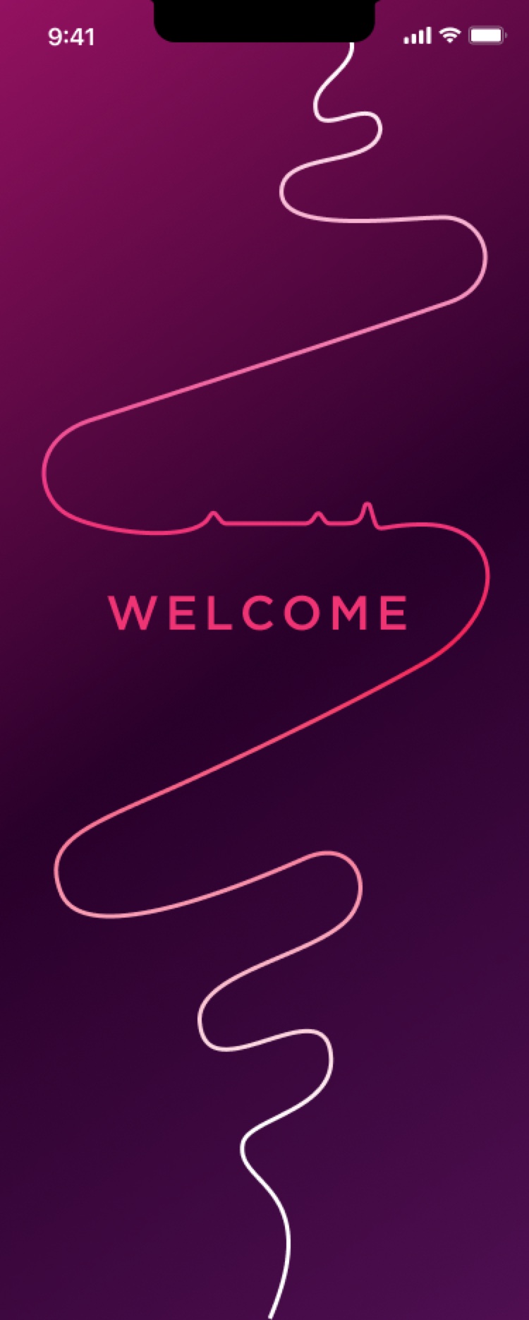

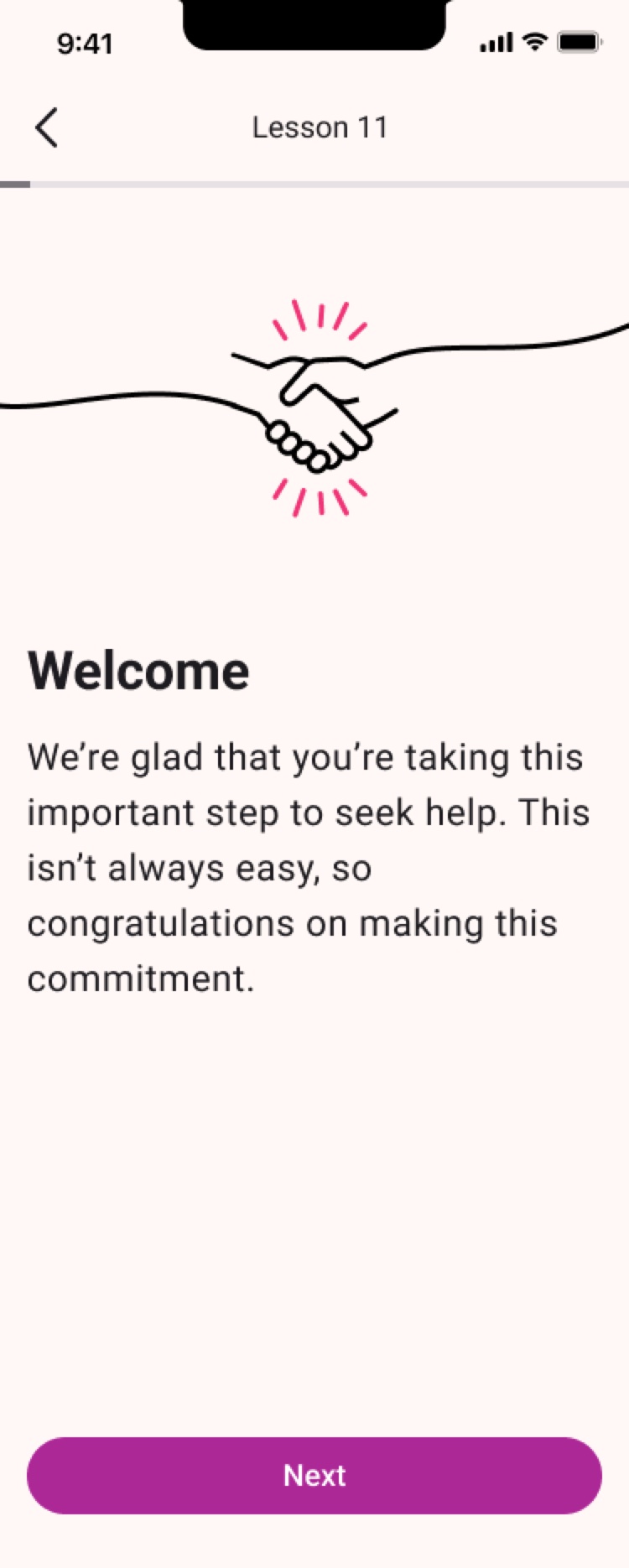
Throughline direction, Welcome screen
Welcome
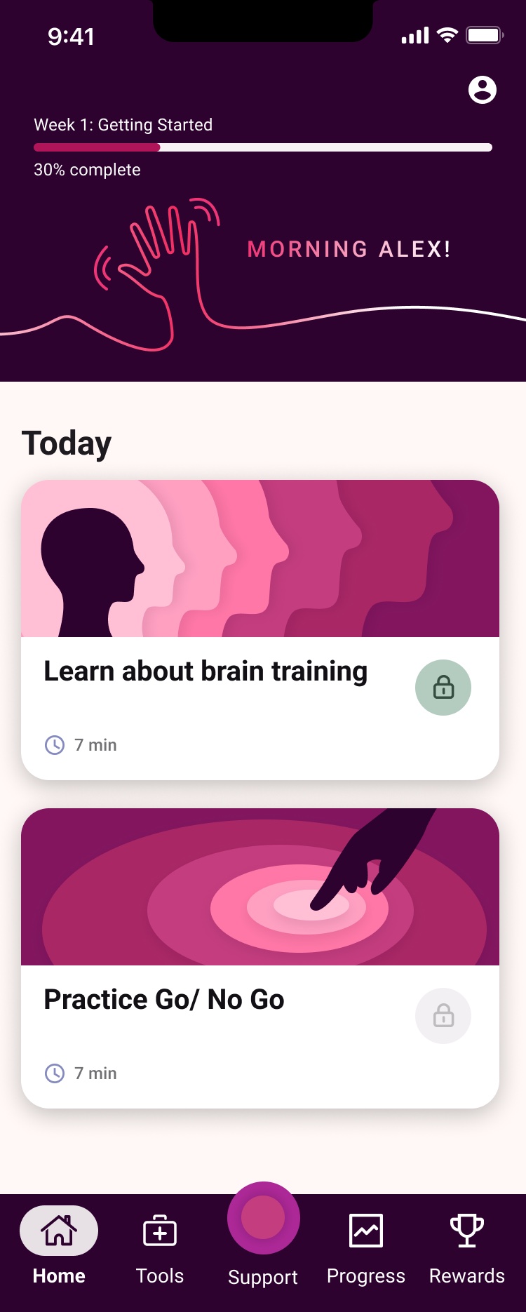
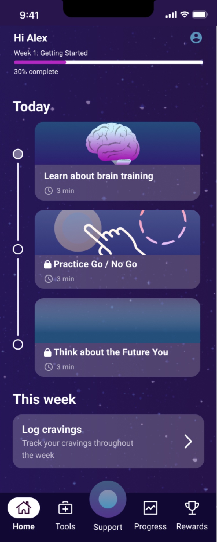
Throughline direction, Home screen
Home
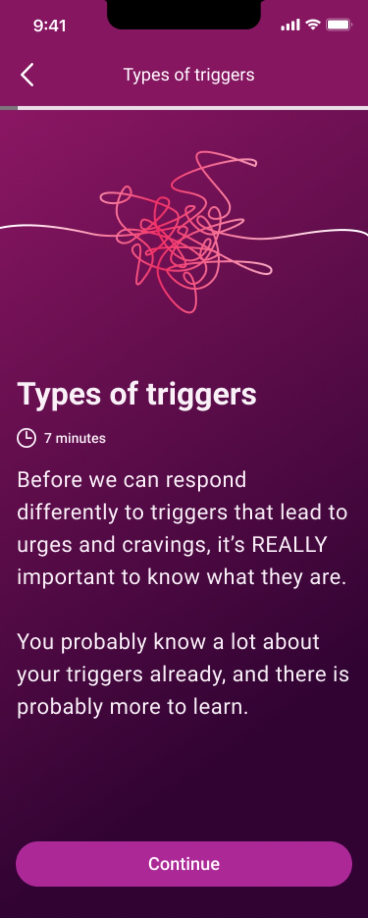
Throughline direction, Lesson intro screen
Lesson intro
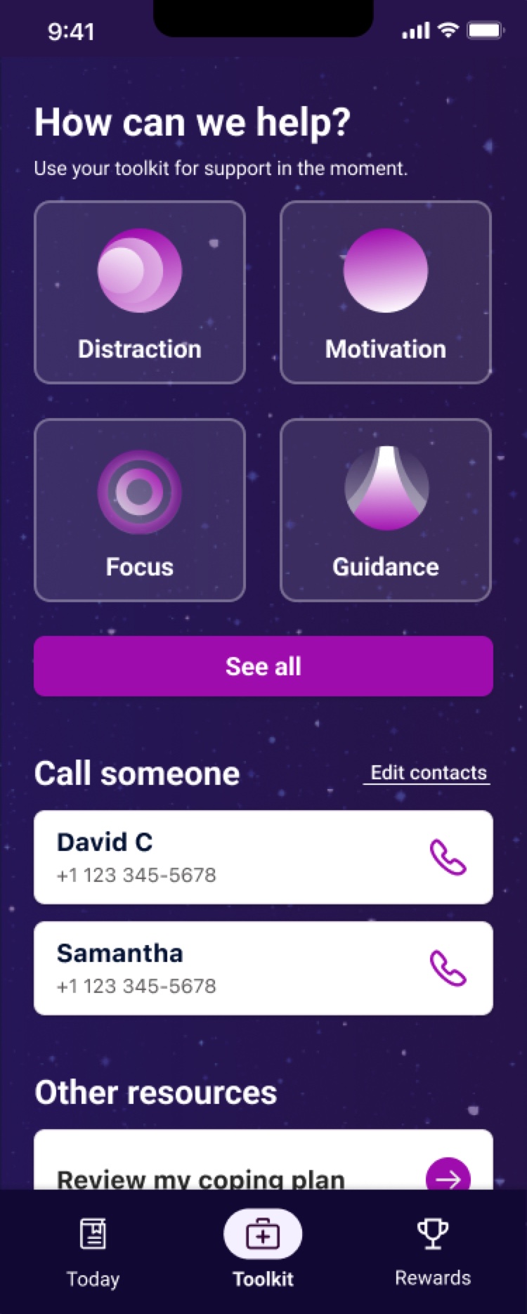
Throughline direction, Toolkit screen
Toolkit
Throughline direction, Lesson screen
Lesson

Direction 1: Throughline

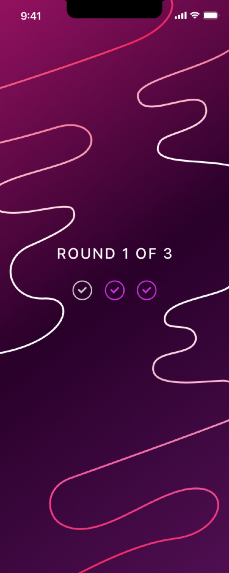
A continuous line runs through every illustration, on deep plum and magenta.

From a waving hand to a tangle of triggers, the one unbroken line suggests a path and partner through recovery.

Throughline toolkit icons: a dotted winding path for Distraction, a line-drawn flame for Motivation, a target and arrow for Focus, and a branching arrow for Guidance, on deep plum cards

Toolkit icons

Throughline direction, Start screen
Start
Throughline direction, A round screen
A round
Throughline direction, Word list screen
Word list
Throughline direction, Playing screen
Playing

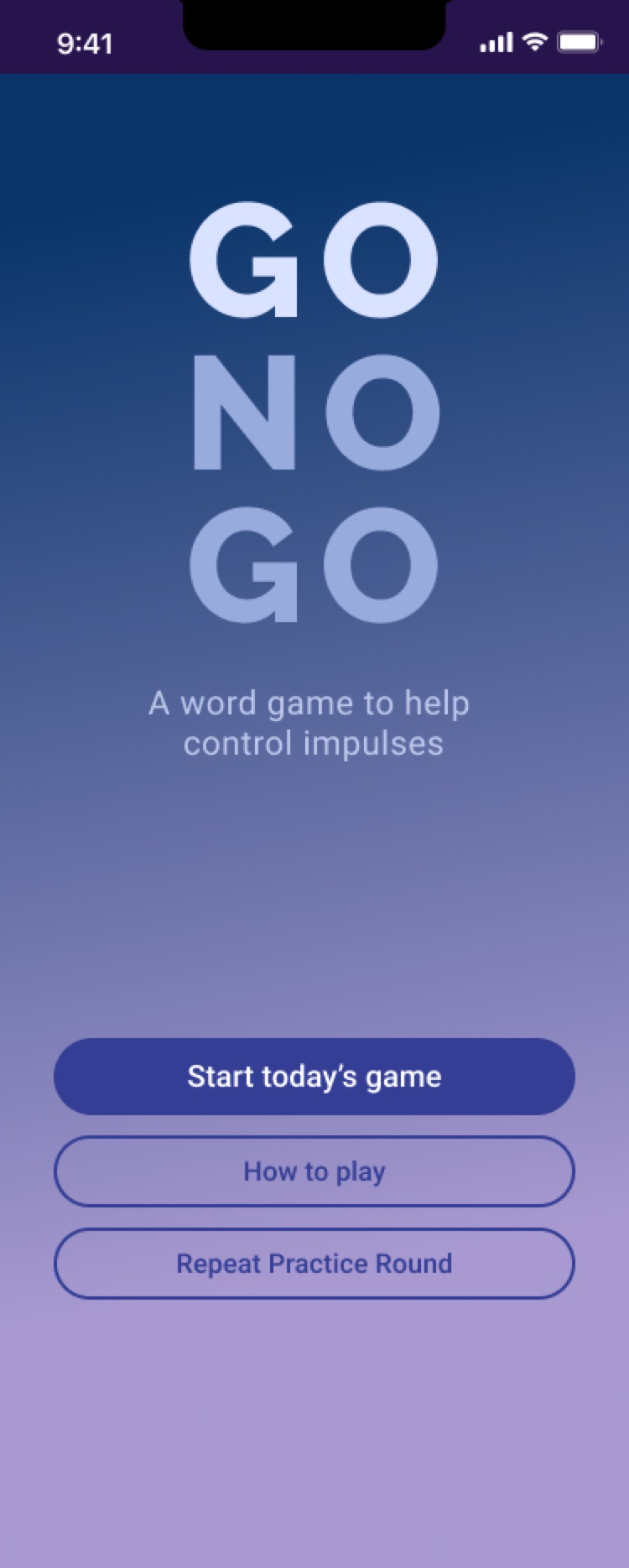
Go/No Go game

Throughline toolkit icons: a dotted winding path for Distraction, a line-drawn flame for Motivation, a target and arrow for Focus, and a branching arrow for Guidance, on deep plum cards

Toolkit icons


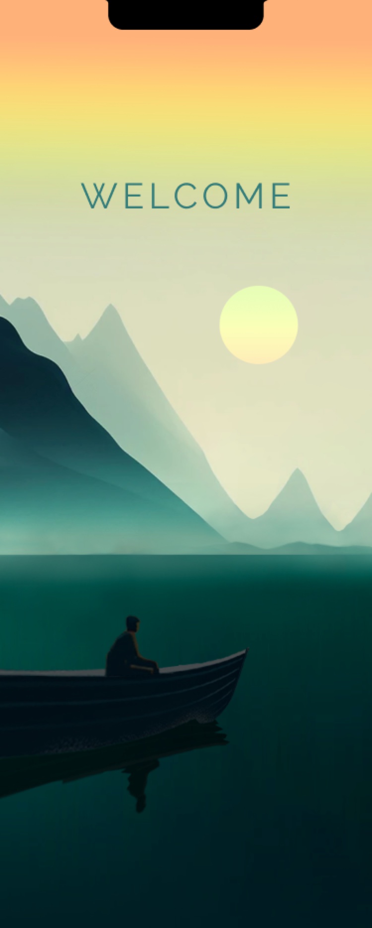
Boat direction, Welcome screen
Welcome
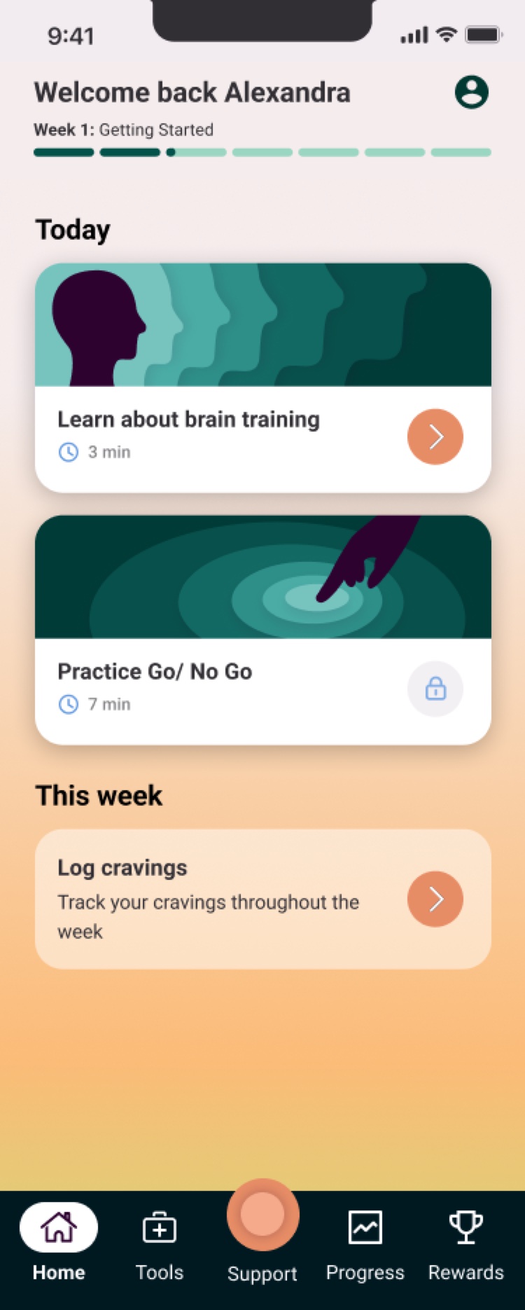
Boat direction, Home screen
Home
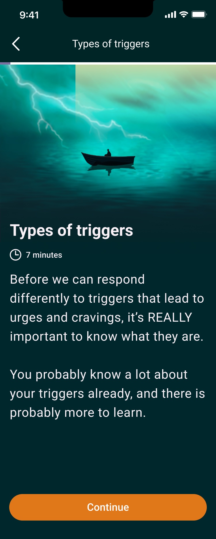
Boat direction, Lesson intro screen
Lesson intro
Boat direction, Toolkit screen
Toolkit
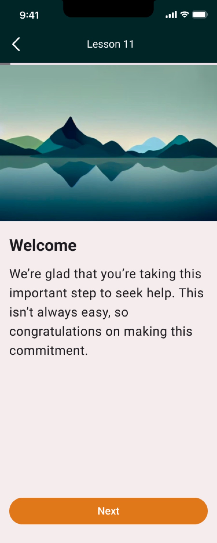
Boat direction, Lesson screen
Lesson

Direction 2: Boat

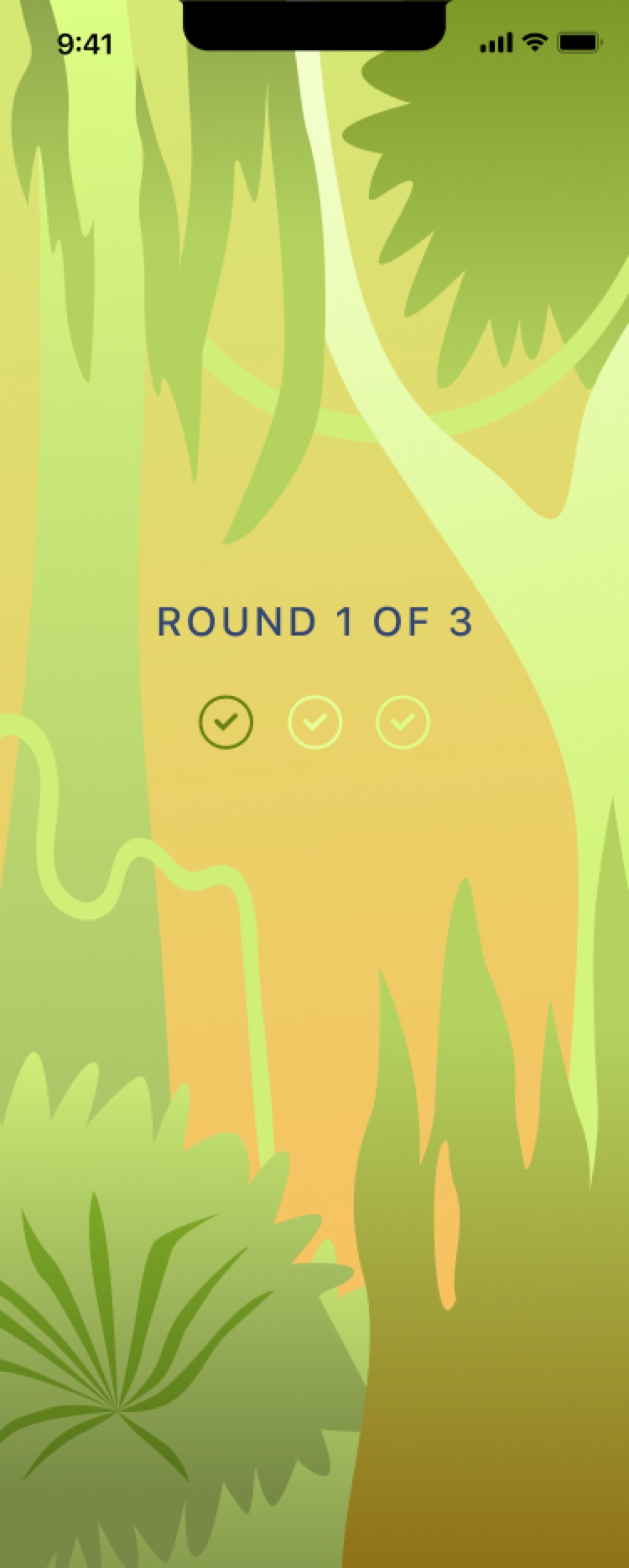
Uncertain, moody atmospheres give way to warm sunrise gradients and lush illustrated landscapes.

A small boat on a stormy sea suggests a journey that moves from turbulence toward calm.
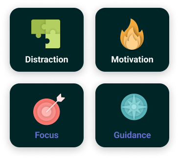
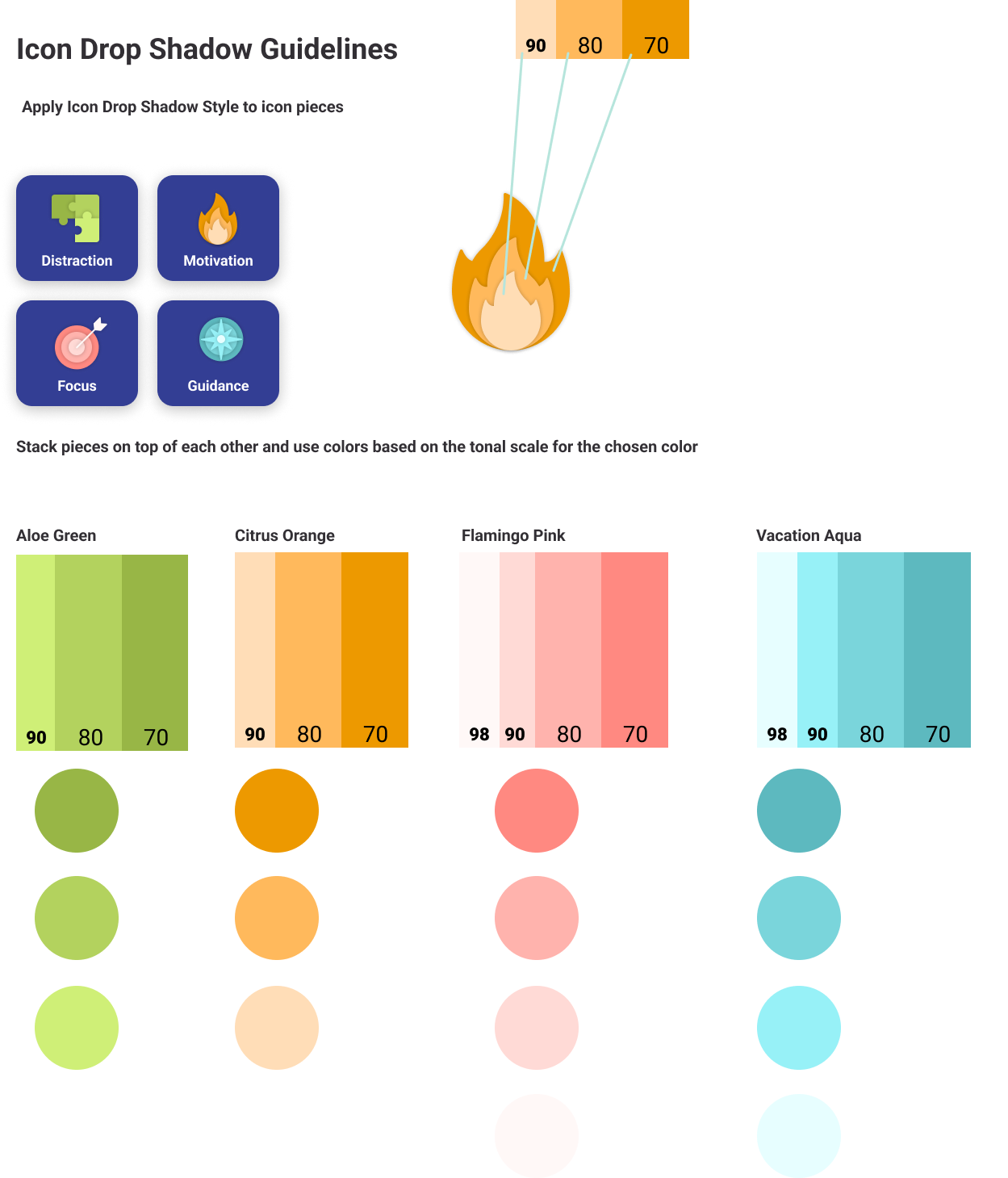
Boat toolkit icons: green puzzle pieces for Distraction, a layered orange flame for Motivation, a coral target for Focus, and a teal compass for Guidance, on dark green cards

Toolkit icons

Boat direction, Start screen
Start
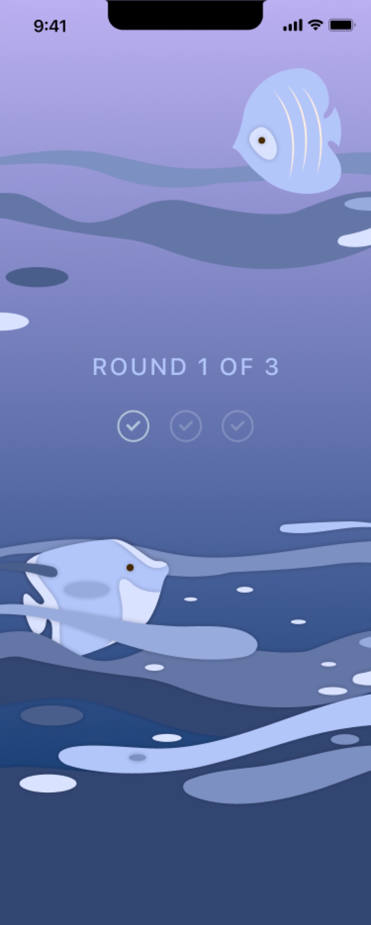
Boat direction, A round screen
A round
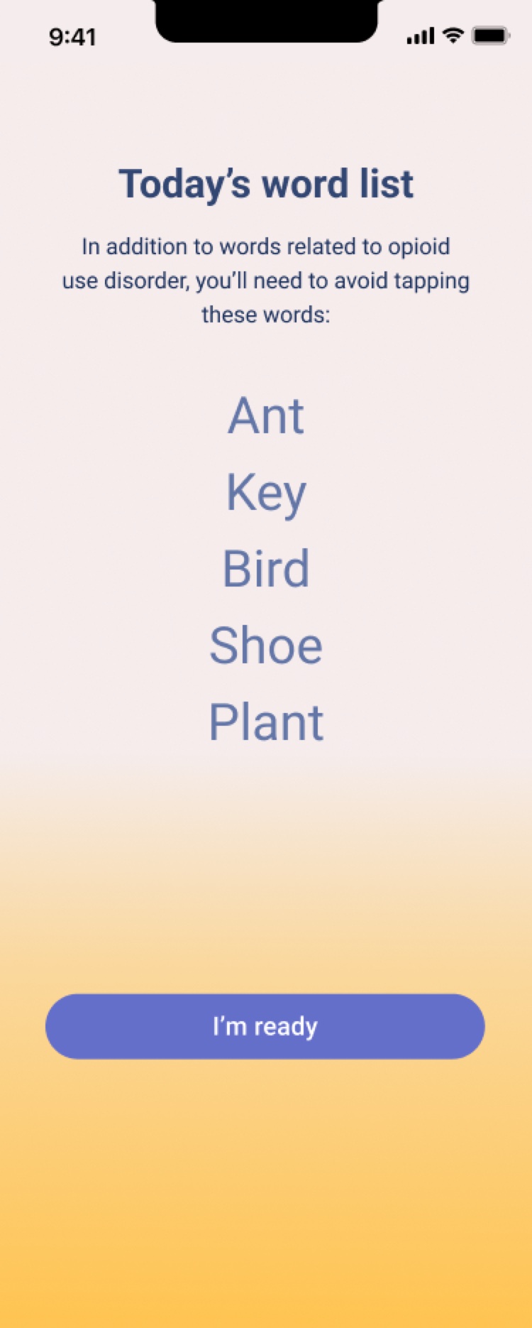
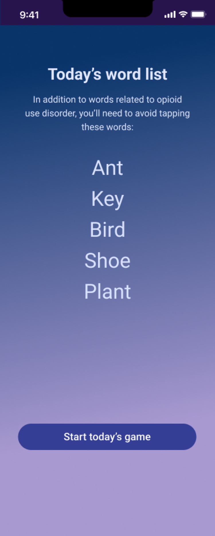
Boat direction, Word list screen
Word list
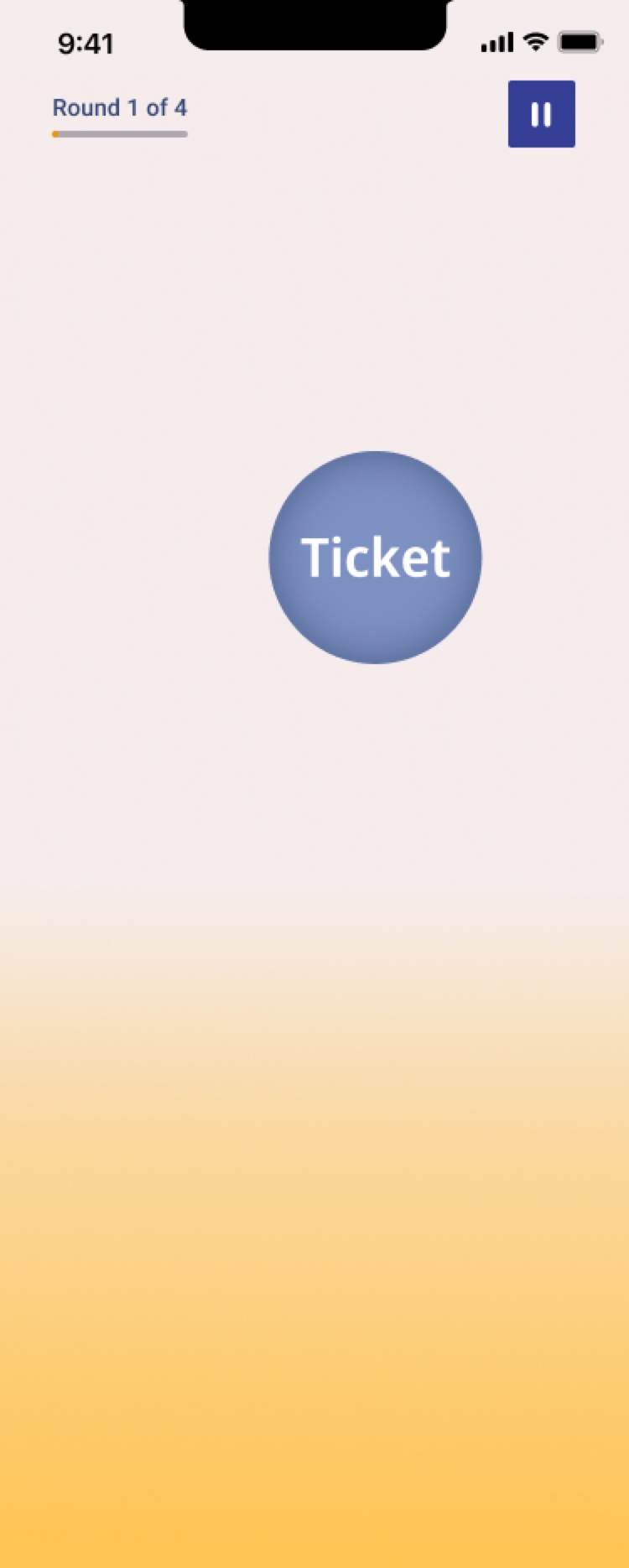
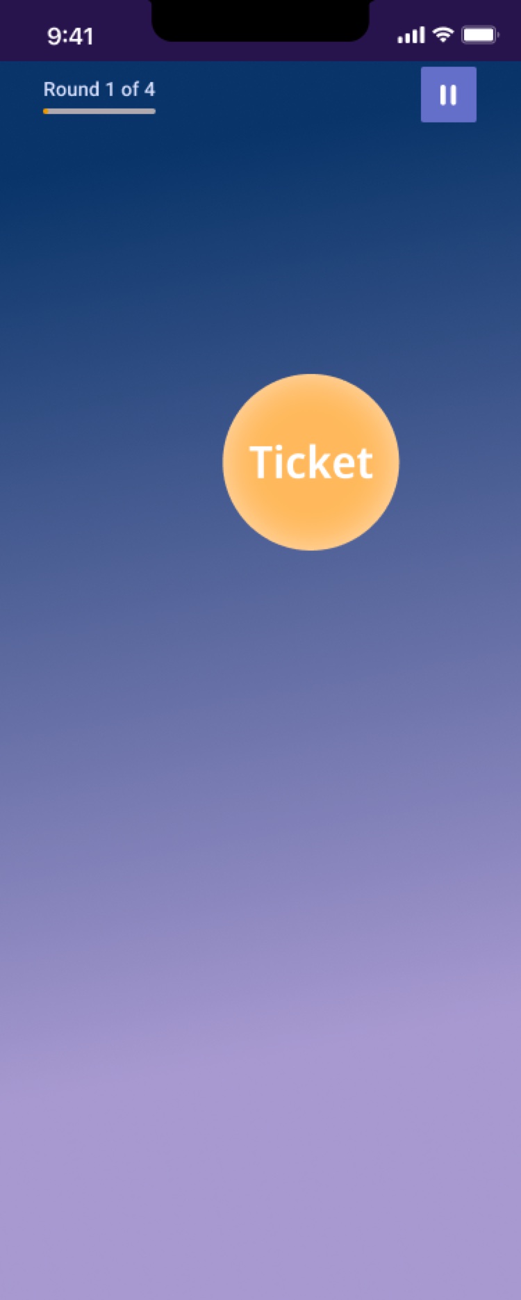
Boat direction, Playing screen
Playing

Go/No Go game

Boat toolkit icons: green puzzle pieces for Distraction, a layered orange flame for Motivation, a coral target for Focus, and a teal compass for Guidance, on dark green cards

Toolkit icons


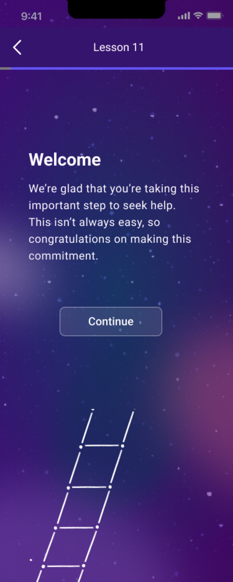
Constellations direction, Welcome screen
Welcome
Constellations direction, Home screen
Home
Constellations direction, Lesson intro screen
Lesson intro
Constellations direction, Toolkit screen
Toolkit
Constellations direction, Lesson screen
Lesson

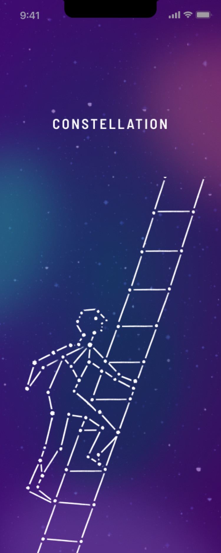
Direction 3: Constellations

A night sky where small points of progress come together into a bigger picture carried from the welcome screen through to the word game.
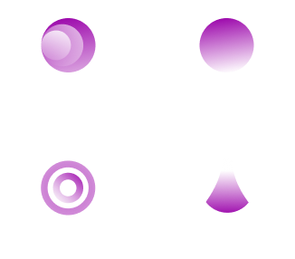
Constellations toolkit icons: glowing violet orbs for Distraction, Motivation, Focus and Guidance, on translucent cards over a starry sky

Toolkit icons

Constellations direction, Start screen
Start
Constellations direction, A round screen
A round
Constellations direction, Word list screen
Word list
Constellations direction, Playing screen
Playing

Go/No Go game

Constellations toolkit icons: glowing violet orbs for Distraction, Motivation, Focus and Guidance, on translucent cards over a starry sky

Toolkit icons


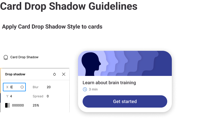
Card drop shadow guideline: a lesson card with its shadow settings, 0 by 4, blur 20, 25 percent black

Card drop shadow

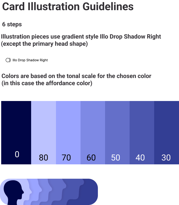
Card illustration guideline: a head silhouette layered in six steps of the affordance color scale

Card illustrations

Icon guideline: the four toolkit icons built from stacked pieces in three or four tones each of Aloe Green, Citrus Orange, Flamingo Pink and Vacation Aqua

Toolkit icons

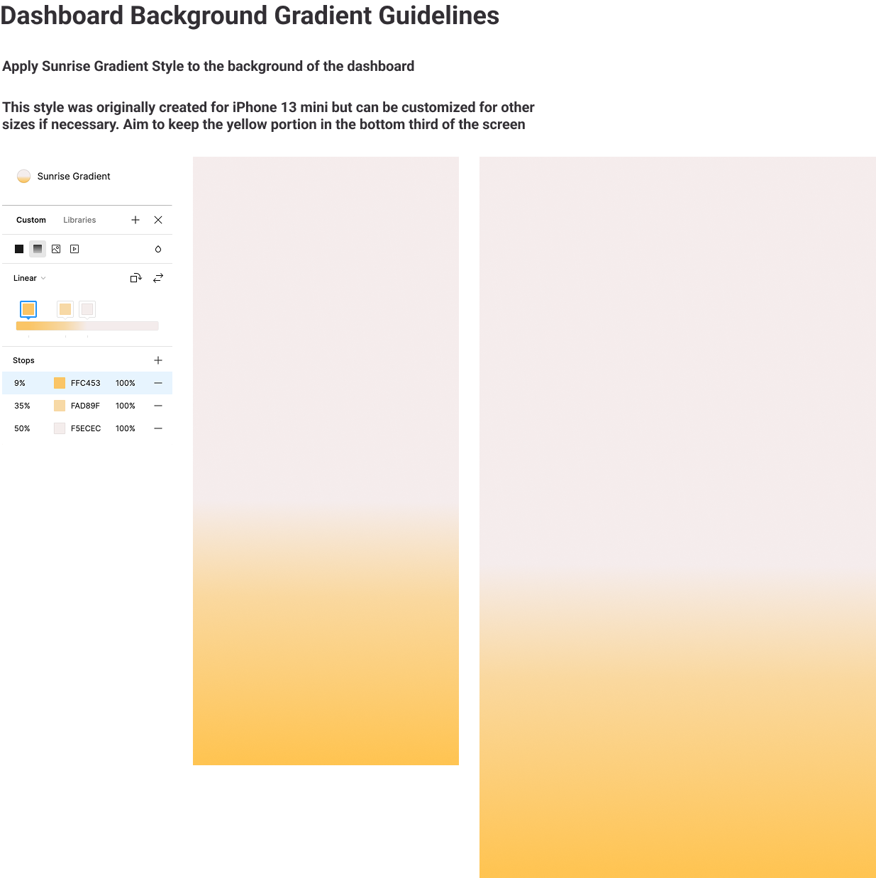
Dashboard background gradient guideline: the sunrise gradient, pale at the top and yellow in the bottom third

Dashboard background gradient

Outcome

Click Therapeutics chose the second direction, Boat, which was then developed into a small design system for the team to build on.

Color foundation: tonal scales from 100 to 0 for validation, error, affordance, neutral, and primary, secondary and tertiary themes, each with its roles marked

Color foundation: tonal scales for validation, error, affordance, neutral and three themes